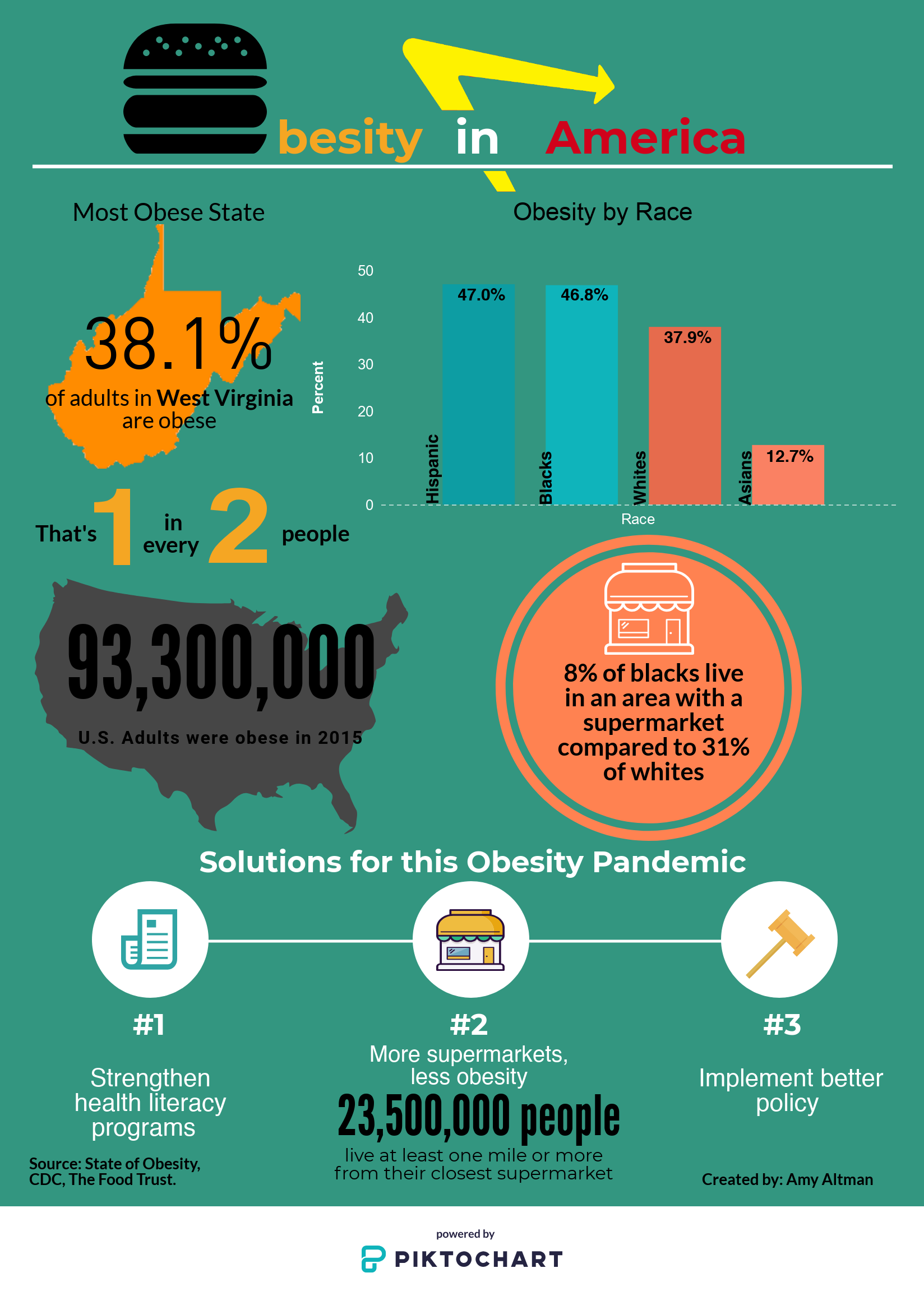
My infographic embodies the obesity problem in America through five statistics that prove this pandemic’s prevalence. The data is from three sources: The Food Trust, CDC, and The State of Obesity. To start, the title, creatively, resembles trademarks of obesity today with the hamburger acting as the “O,” the yellow arrow that characterizes the “In-n-Out” logo, and the word, “America,” in all red, which is similar to the McDonald’s brand. From the bottom down, there are a series of factual data points that prove obesity’s prevalence in America. I chose to highlight the most obese state, West Virginia, which is located in one of the most obese countries, America. According to the CDC, the obesity problem in West Virginia is so high that almost half the population suffers from this disease and this was shown in the bold numbered statement, “1 in every 2.” Furthermore, I decided to include the comparison to the U.S., which has an obesity percentage of 39.8%, according to the CDC. I included the amount of people in the US who suffered from obesity in 2015 to prove the relevance of this pandemic and I think this statistic provides a general overview for the data points listed to its right. The next data set, which the statistics are from the The State of Obesity, shows the obesity rates by race in a bar graph form. I thought it was important to include this aspect of Obesity because America is so diverse and to highlight which races suffer the most from this disease. Research has proven that hispanics and blacks have the highest rates of obesity, which is correlated to the systemic inequalities they face, in regards to income, regionality, and a lack of general health knowledge (The Food Trust). A lack of income results in purchasing less fresh produce and resorting to eating at convenient or fast food stores. This reality impacts the amount of supermarkets in a consumers area, which is drastically lower in a predominantly black area than white area (The Food Trust). The final reason that impacts where hispanics or blacks are placed on this obesity chart is the lack of health literacy. Nutrition labels are confusing and not always made in english, which affects who can read them and in turn what the consumers eat. These three factors that exacerbate this pandemic can be solved with the implementation of more supermarkets, accessible health education, and better policy.
Professor Alison Trope and Professor Rebecca Haggerty have emphasized the importance of intention and the gatekeeping role. Infographics contain intentionally placed graphics and statistics to prove the point the author is trying to make, which has an impact on objectivity. It’s important to not display fragments of statistics because that is deceptive and inaccurate for the audience to consume; however, this reality has become naturalized even though “media messages are selective and incomplete” (Create to Learn, 64). Infographics are soft on the eyes, but can be very informative; however, as consumers and gatekeepers we must produce accurate and factually driven statistics to portray the overall message, which in this case resembled obesity in America, the factors involved in this pandemic, and potential solutions.
